
Loading brochure... 0%
Vadodara
Commercial Monolith
Client
VS Group
VS Monolith
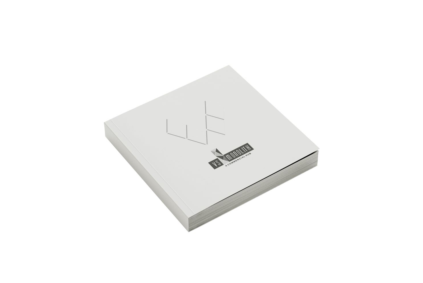
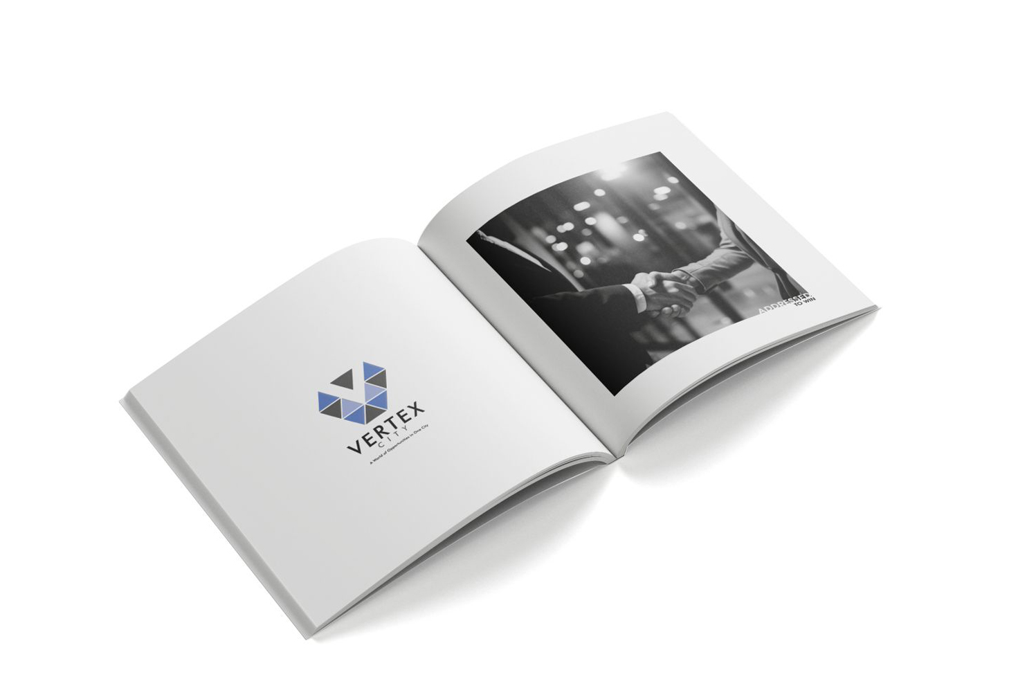
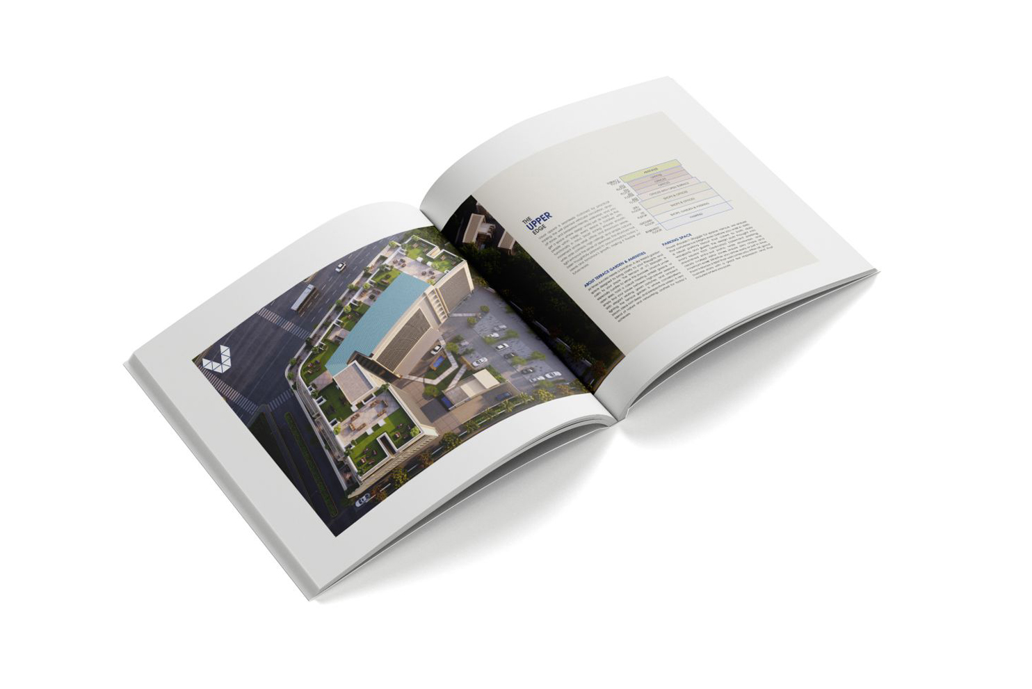
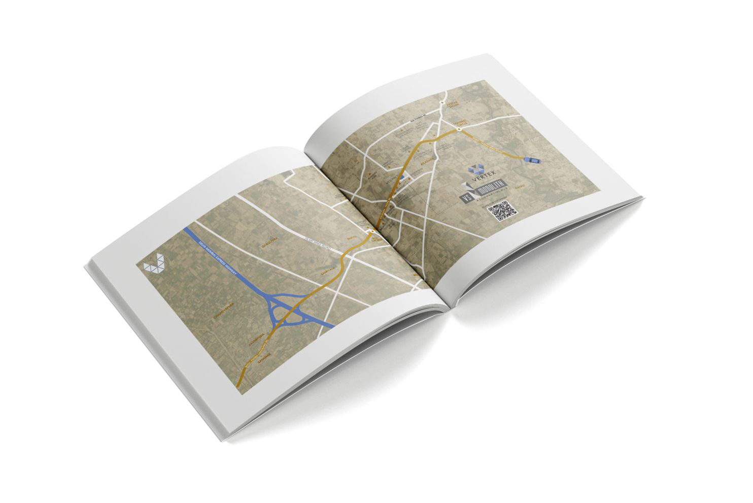
VS Monolith was positioned to look established before the first business moved in. We translated its commanding architecture, premium commercial spaces and strategic accessibility into a communication language with weight: bold geometry, disciplined layouts and headlines that spoke the language of ambition. A distinctive geometric identity and restrained corporate palette worked together to make one promise clear: business belongs here.

PreviousTSL
NextHappy Mall