Loading brochure... 0%
Vadodara
Corporate Brochure
Client
Samruddhi Group
Samruddhi
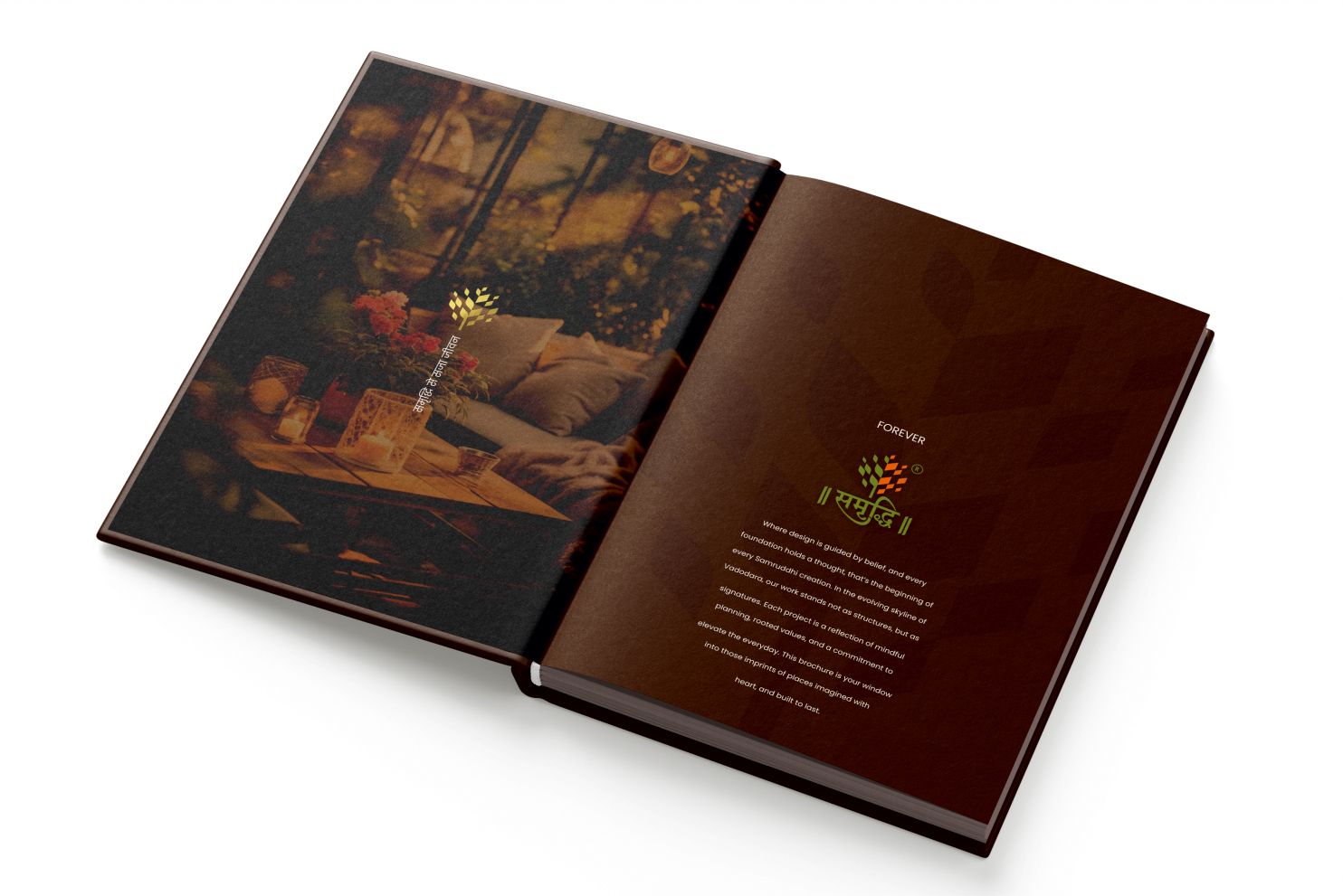
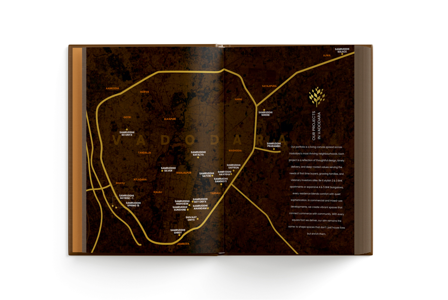
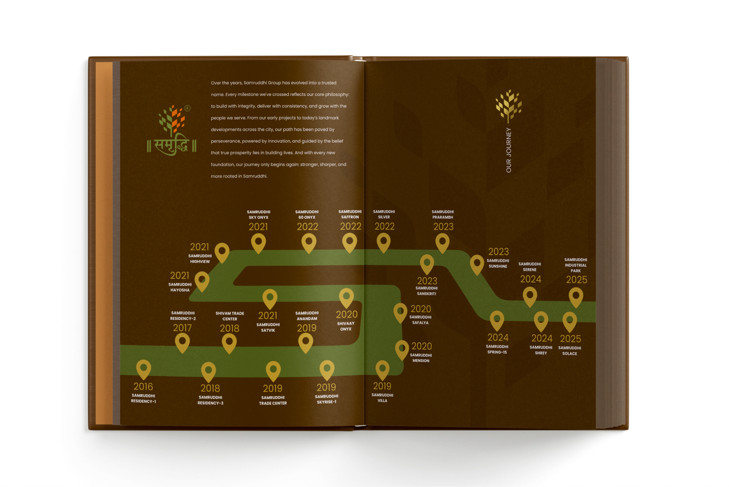
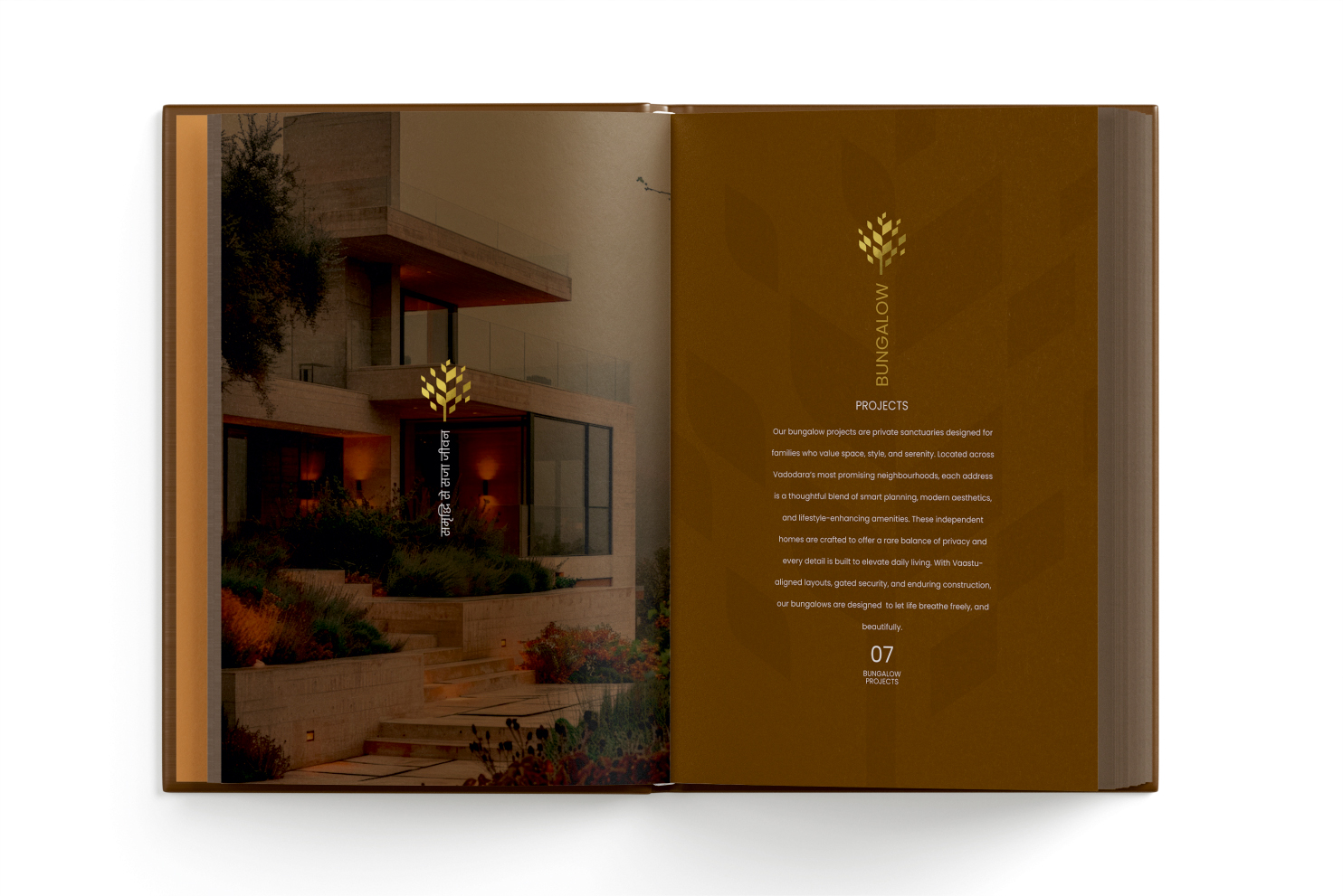
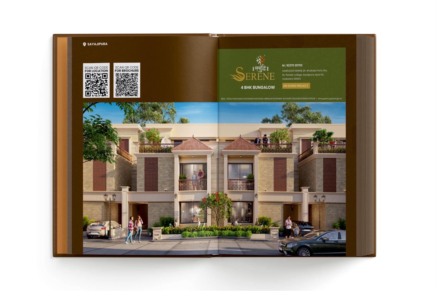
A clear chapter-based structure made the extensive portfolio easy to explore without making it feel like a catalogue. The writing balanced corporate confidence with warmth, while a consistent design language connected projects of different types, scales and stages. Growth became the central thread, expressed through a branching tree device, an earthy brown backdrop and accents of gold and green. The visual language felt warm, grounded and established, while still giving every project a premium presence.

PreviousRatnam
NextKrrish Group