
Loading brochure... 0%
Nashik
Corporate Brochure
Client
Krrish Group
Krrish Group
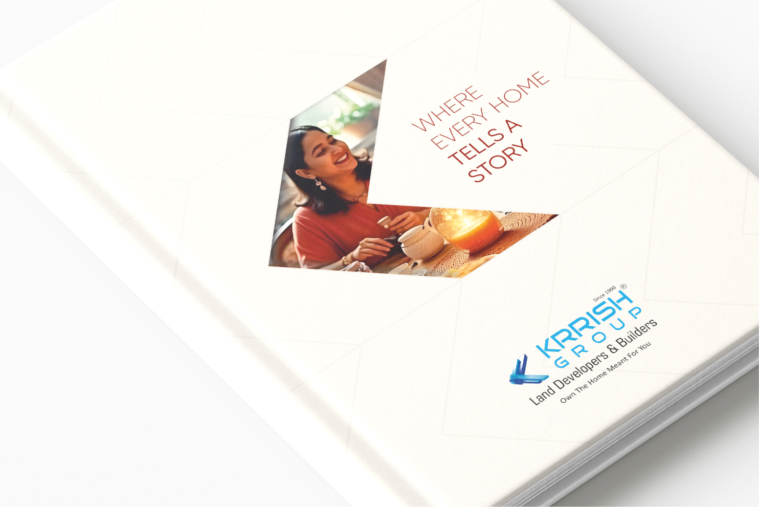
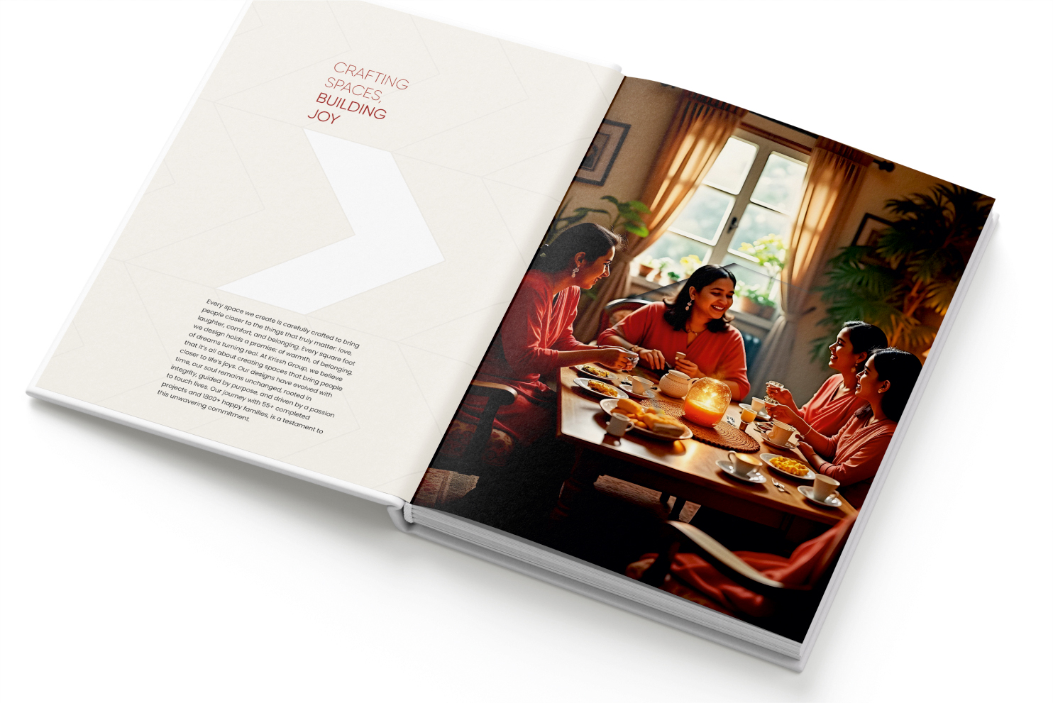
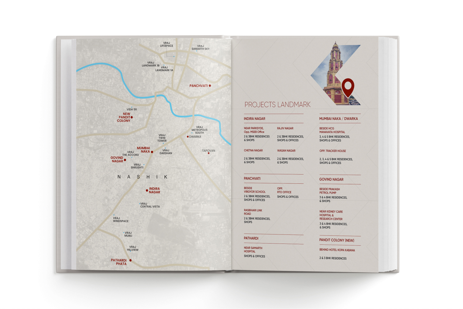
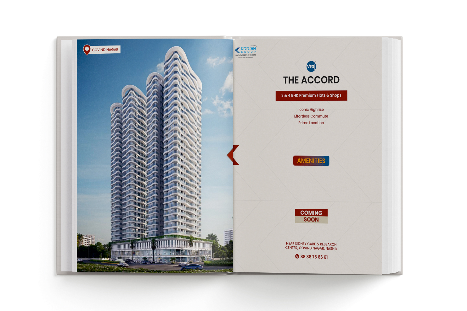
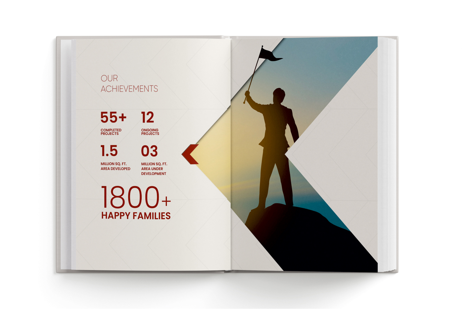
A clean visual structure brought consistency to the diverse portfolio. The recurring arrow-inspired graphic created movement across the narrative, while maps, milestones and project information were arranged for effortless reading. Residential and commercial developments were presented as individual successes, yet remained connected to one strong corporate identity. The closing narrative brought attention back to the principles supporting that growth: quality, integrity, customer trust and relationships built over time.


PreviousSamruddhi
NextGreenleaf Heritage