Working with developers across multiple cities in India has revealed a consistent pattern. Projects that communicate clearly through their brochures always outperform those that rely only on location or pricing.
The difference is rarely the budget. It is communication.
And in real estate, one of the most overlooked communication tools is still the brochure.
A high-performing
real estate brochure in India works because it simplifies decision-making. It connects the project’s location, offering, and credibility into one clear narrative. When structured correctly, it builds trust within minutes and guides the buyer toward action. Combined with digital touchpoints, it becomes a conversion tool, not just a design asset.
Why brochures still decide real estate sales in India
There is a common assumption that brochures are outdated. It’s easy to assume that everything now depends on Instagram ads, Google campaigns, and listings. In reality, when a serious buyer engages, they slow down. They look for something tangible, something they can go through at their own pace, without distraction. That is where the brochure comes in.
We have seen this repeatedly across projects. A buyer might discover you online, but the brochure is where they start evaluating you seriously.
Most buying decisions are not made during the first interaction. They happen later, when the buyer revisits the information. Often alone. Sometimes with family.
The brochure stays with the buyer during the decision phase, while ads fade away. This is what gives it lasting influence.
What makes a high-converting real estate brochure
You can usually tell within a few pages whether a brochure was made to “show” or to “sell”.
The brochures that perform well follow a clear structure. They don’t jump between ideas or overwhelm the reader, even when someone is just flipping through.
In our experience, the strongest brochures are built around a simple flow.
First, establish what the project is about. Credibility comes next. Then the offering is explained in a simple, easy-to-understand way. Only after that does it move towards action. This is what makes something stand out in a crowded market. Most people reverse this. They start with features. Then add visuals. Then try to fit messaging around it. That rarely works.
Before getting into the structure, one thing needs to be clear.
Creative real estate advertising is not about doing something different for the sake of it. It is about removing confusion. This is what helps a project stand out in a crowded market.
Now, when you break it down practically, strong brochures usually follow a few consistent principles:
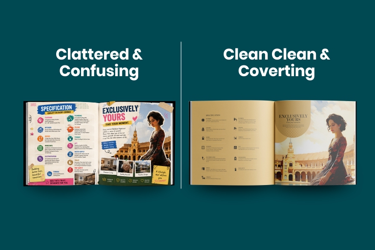
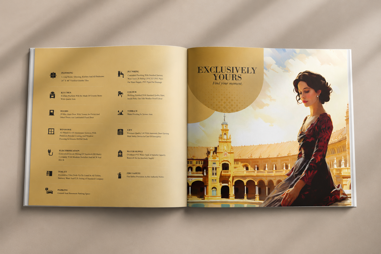
- The opening pages are clean and focused, not overloaded
- The project positioning is clear within seconds
- Visuals support the message instead of overpowering it
- Information is layered, not dumped all at once
The goal is not to make the brochure look good. The goal is to make the buyer feel certain.
Understanding Indian real estate buyer psychology
This is where most brochure strategies fail. Indian buyers do not move forward just because something looks premium. They move forward when risk feels reduced.
Why this shift matters
A buyer going through your brochure is not asking, “Is this beautiful?” They are asking, “Is this safe? Is this worth it? Can I trust this?”
In multiple projects we have worked on, the sections that got the most attention were not lifestyle pages. They were location maps, connectivity, and project details.
What this reveals about buyer behaviour
Clarity builds confidence faster than aspiration.
Also, buyers often share brochures with family members who were not part of the original interaction. Which means your brochure needs to explain the project to someone seeing it for the first time.
Many brochures fall short at this stage. They assume the reader already understands the context, which is rarely the case. Once confusion enters, interest starts dropping.
Design elements that actually drive results
Design choices are rarely neutral. They influence how information is understood.
A dense layout makes even a good project feel complicated. A clean layout makes it feel more approachable.
Typography, spacing, and color all play a role here, but not in isolation.
The bigger factor is alignment.
Your brochure should feel like an extension of your overall
site branding real estate presence. If your hoardings, site office, and digital ads tell one story, and your brochure tells another, the buyer notices.
Not consciously. But the doubt shows up. We have seen projects lose credibility simply because their materials did not feel connected.
Consistency is not a branding luxury. It is a trust signal.
Content that actually sells, not just fills space
Most brochures are either overloaded or underwhelming. There is very little middle ground. Some try to include everything. Others say so little that the buyer is left guessing.
Neither works.
The real challenge is not writing more content. It is deciding what not to include.
A strong brochure focuses on what the buyer actually needs to move forward. This usually includes positioning, key benefits, and enough detail to reduce hesitation.
Here is something important.
Buyers rarely read brochures from start to finish. They skim. They jump sections. They pause only when something catches their attention.
So your content needs to work even in fragments. You cannot rely on a linear reading experience.
Which means structure matters as much as messaging.
Common mistakes developers keep repeating
Most mistakes come from trying to do too much at once. Trying to impress instead of clarify. Trying to say everything instead of saying the right things.
Once that mindset is in place, the execution starts breaking.
The most common issues we see:
- Too much information packed into every page
- Generic phrases that could apply to any project
- No clear narrative or flow
- Important details buried under design elements
We once worked on a project where the brochure had all the right information, but none of it was easy to find. Buyers were interested, but they kept asking basic questions.
This is usually a clear sign the brochure is not doing its job. Fixing that did not require redesigning everything. It required restructuring.
Why a real estate brochure design agency matters
There is a visible difference between a brochure that is designed and one that is thought through.
A generic designer focuses on how things look. A specialized
real estate brochure design agency focuses on how things perform.
At
Zurich Graphics, we approach brochures as part of a larger system. Not as standalone pieces.
This ensures every brochure is aligned with:
- overall project positioning
- site branding
- sales conversations
- and increasingly, digital integration
This is where developers start noticing the difference.
Because the brochure starts reducing the load on the sales team, it answers questions before they are asked.
Role of digital integration in brochure performance
There was a time when brochures existed on their own. This approach no longer holds up.
Today, a brochure can lead directly into a digital journey. A QR code, a simple link, or even a WhatsApp flow can extend the interaction.
We have seen projects improve lead quality just by connecting brochures to the right landing experience.
This is where
real estate digital marketing and print start working together.
Offline creates interest. Digital captures and tracks it.
And when both are aligned, you start seeing consistency in results.
Questions We keep hearing from developer and teams